# A tibble: 10 × 6
   type      address          postcode   price distance regionname
   <chr>     <chr>               <dbl>   <dbl>    <dbl> <chr>
 1 House     85 Turner St         3067 1480000      2.5 Northern Metro
 2 House     25 Bloomburg St      3067 1035000      2.5 Northern Metro
 3 House     5 Charles St         3067 1465000      2.5 Northern Metro
 4 House     40 Federation La     3067  850000      2.5 Northern Metro
 5 House     55a Park St          3067 1600000      2.5 Northern Metro
 6 House     129 Charles St       3067  941000      2.5 Northern Metro
 7 House     124 Yarra St         3067 1876000      2.5 Northern Metro
 8 House     98 Charles St        3067 1636000      2.5 Northern Metro
 9 House     217 Langridge St     3067 1000000      2.5 Northern Metro
10 Townhouse 18a Mollison St 3067 745000 2.5 Northern MetroTutorial 3: Data Visualisation for Business Intelligence
Learning Goals
By the end of this tutorial, you should be able to:
- Explain how different
ggplot2visualization techniques reveal patterns in the Melbourne housing market that would be difficult to see in tables or raw numbers. - Use
ggplot2to create histograms, and scatterplots that analyze relationships between property prices, location, and dwelling types. - Apply transformations such as log scales, proportions, and faceting to improve the interpretability of price distributions and spatial trends.
- Customize
ggplot2plots using themes, color palettes, and annotations to enhance clarity and storytelling. - Evaluate and compare visualization approaches, identifying which effectively communicate insights about housing price trends and spatial patterns.
- Build and refine a visual analysis workflow that could inform practical decision-making for home buyers, investors, or urban planners
The Business Challenge
The Topic: Understanding Melbourne’s Housing Market
Melbourne’s real estate market is one of the most dynamic in Australia. Property prices are influenced by several factors, including location, dwelling type, and proximity to the Central Business District (CBD). Buyers, sellers, and policymakers constantly analyze housing trends to make informed decisions. Understanding these trends is crucial in a $2 trillion+ housing market, where even small fluctuations in pricing expectations can have significant financial impacts.
A key question we will explore is: How do property prices vary by region, dwelling type, and location? By analyzing real estate data, we can identify patterns that help explain the drivers of Melbourne’s housing prices and their implications for different stakeholders in the market.
The Data: The Melbourne Housing Market Dataset
We will use a dataset containing real estate sales data from Melbourne. The dataset provides insights into housing trends and includes key variables that influence property prices.
The dataset captures the property location within broader metropolitan regions (regionname), allowing us to compare trends across different areas. It also includes the type of dwelling, classified as House (h), Townhouse (t), or Apartment (u), enabling us to assess price differences based on housing type. The sale price (price) provides a measure of market value, while the distance to the CBD (distance) helps analyze the impact of proximity to the city center on property prices.
Similar datasets are widely used by real estate analysts, banks, and property investors to assess housing trends, predict future movements, and guide investment decisions. Through this tutorial, we’ll work with real-world data to uncover patterns and develop a deeper understanding of Melbourne’s property market. Let’s dive in!
Where we’re headed
Just a few lines of R code transform numbers to data visualizations.
From this:
to this:
`geom_smooth()` using formula = 'y ~ x'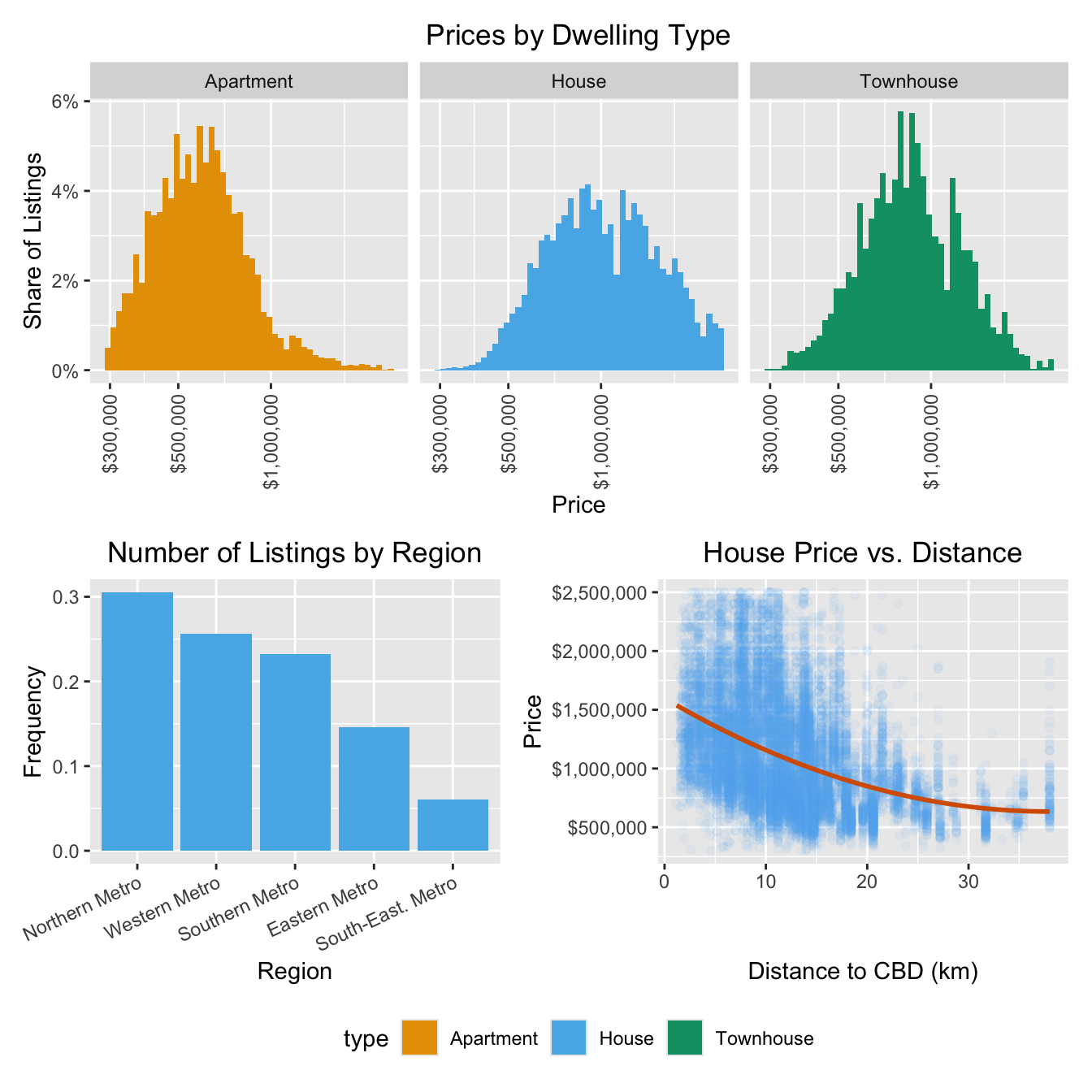
Loading the Data
R packages for today
library(tidyverse)  # for plotting, includes ggplot
library(patchwork)  # for combining multiple plots into subfigures
library(scales)     # for formatting axis scales
library(ggokabeito) # color blind friendly color palette -- this course's default
Loading the Data in R
housing <-
    read_csv("data/melbourne_housing.csv")
Prepare these Exercises before Class
Prepare these exercises before coming to class. Plan to spend 45 minutes on these exercises.
Switch the
eval flag to TRUE when you want to evaluate code!
In the R code chunks below we have provided starter code for you to work from. We have set the key eval to the value false so that they are not run because they have syntax such as YOUR_VALUE_HERE which would generate errors.
Switch the eval value to TRUE when you want the R code within a chunk to be run when you compile your document.
Exercise 1: Understanding ggplot2 Syntax
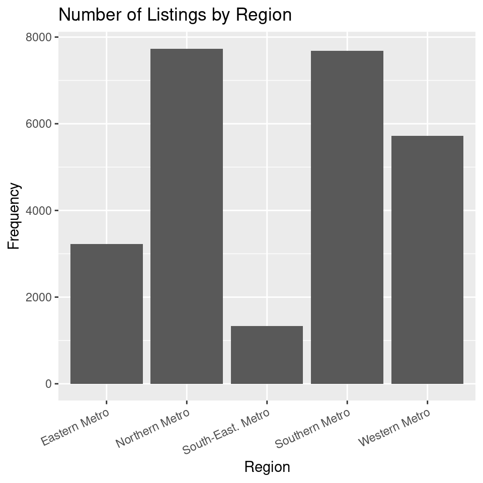
Consider the code below:
ggplot(housing,
       aes(x = regionname)
       ) +
  geom_bar() +
  labs(
    x = "Region",
    y = "Count",
    title = "Number of Listings by Region"
  )
(a) What does ggplot(housing, aes(x = regionname)) do?
(b) What is the role of aes(x = regionname) in this code?
(c) What does geom_bar() add to the plot?
(d) What does labs() do?
(e) In this code, what does the + operator do?
(f) Run the code above to produce the bar plot.
Exercise 2: Visualizing the distribution of Prices by Dwelling Type
By the end of this exercise, your plot should look similar to this one:
(a) Why is a histogram useful for understanding price distributions? What insights can we gain from plotting price distributions separately for each dwelling type?
What is a Histogram?
A histogram is a visualization that represents the distribution of numerical data by dividing values into bins and counting the number of observations in each bin. Unlike a bar plot, which displays categorical data, a histogram is used for continuous variables like price, age, or distance.
Histograms help identify patterns in data, such as skewness, outliers, and central tendencies, making them a crucial tool for understanding how values are distributed in a dataset.
(b) Use the starter code below to create a basic histogram of house prices. Replace YOUR_VARIABLE_NAME with the correct variable.
ggplot(housing,
       aes(x = YOUR_VARIABLE_NAME)
       ) +
    geom_histogram(bins = 50)
(c) Extend the plot above by adding labels to the x-axis, y-axis, and title using the labs() function.
ggplot(housing,
       aes(x = YOUR_VARIABLE_NAME)
       ) +
    geom_histogram(bins = 50) +
    labs(x = "YOUR_X_AXIS_LABEL",
         y = "YOUR_Y_AXIS_LABEL",
         title = "YOUR_TITLE"
         )
(d) Modify the plot so that you create separate histograms for each dwelling type by adding the facet_wrap(~type) layer to the plot
ggplot(housing,
       aes(x = price)
       ) +
    geom_histogram(bins = 50) +
    labs(x = "YOUR_X_AXIS_LABEL",
         y = "YOUR_Y_AXIS_LABEL",
         title = "YOUR_TITLE"
         )
    YOUR_CODE_HERE
(e) What does the histogram tell you about price differences between dwelling types?
Exercise 3: The Price - Distance Relationship
By the end of this exercise, your plot should look similar to this one:
`geom_smooth()` using formula = 'y ~ x'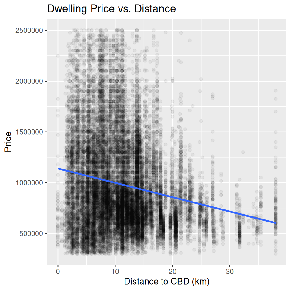
(a) Why might we expect a relationship between price and distance to the CBD?
(b) Use the starter code below to build a scatter plot of price vs. distance, replacing YOUR_VARIABLE_NAME with the correct column names.
What is a Scatter Plot?
A scatter plot is used to visualize the relationship between two continuous variables by plotting individual data points. Each dot represents one observation, helping identify patterns, clusters, and trends. In this case, it allows us to explore how house prices change with distance.
ggplot(housing,
       aes(x = YOUR_VARIABLE_NAME, y = YOUR_VARIABLE_NAME)
       ) +
    geom_point()
(c) Since we have a large number of data points, many overlap, making it difficult to distinguish individual observations. Modify the geom_point() function to reduce over-plotting by adjusting the alpha value. Experiment with different values (e.g., 0.1, 0.05, 0.01) and describe how each affects the visualization.
ggplot(housing,
       aes(x = YOUR_VARIABLE_NAME, y = YOUR_VARIABLE_NAME)
       ) +
    geom_point(alpha = YOUR_NUMBER)
(d) We can better understand the relationship by adding a statistical transformation to the plot. Add a fitted line using geom_smooth(method = "lm", se = FALSE).
ggplot(housing,
       aes(x = YOUR_VARIABLE_NAME,
           y = YOUR_VARIABLE_NAME)
       ) +
    geom_point(alpha = YOUR_NUMBER) +
    YOUR_CODE_HERE
(e) Finally, add labels to the x-axis, y-axis, and title using the labs() function. Adjust the x- and y-axis scales as you deem appropriate.
ggplot(housing,
       aes(x = YOUR_VARIABLE_NAME, y = YOUR_VARIABLE_NAME)
       ) +
    geom_point(alpha = YOUR_NUMBER) +
    YOUR_CODE_HERE +
    labs(x = "YOUR_LABEL",
         y = "YOUR_LABEL",
         title = "YOUR_TITLE"
         )
(f) What does the scatter plot reveal about the relationship between house prices and distance to the CBD? How does the line help interpret this relationship?
In-Class Exercises
You will discuss these exercises in class with your peers in small groups and with your tutor. These exercises build from the exercises you have prepared above, you will get the most value from the class if you have completed those above before coming to class.
Exercise 4: Improving the Price Distribution Plot
(a). Together with your peers, propose three changes you want to make to the plot in Exercise 2. Discuss the rationale behind each change and how it might improve the visualization.
(b). Work with your tutor to create an agreed upon list of changes to make to the plot. What steps do you need to take to make these improvements?
(c). Implement the changes suggested in the R code.
Exercise 5: Improving the Price-Distance Relationship Plot
(a). Together with your peers, propose two changes you want to make to the plot in Exercise 3. Discuss the rationale behind each change and how it might improve the visualization.
(b). Work with your tutor to create an agreed upon list of changes to make to the plot. What steps do you need to take to make these improvements?
(c). Implement the changes suggested in the R.
Exercise 6 [Optional, if time]: Improving the Listings by Region Plot
(a). Together with your peers, propose two changes you want to make to the plot in Exercise 1. Discuss the rationale behind each change and how it might improve the visualization.
(b). Work with your tutor to create an agreed upon list of changes to make to the plot. What steps do you need to take to make these improvements?
(c). Implement the changes suggested in the R.
Exercise 7: Putting the plots together
(a). Use the code below to combine the plots from the exercises above. Replace PLOT_ONE, PLOT_TWO, and PLOT_THREE with the plots you created in Exercises 4, 5, and 6.
PLOT_ONE /
    (PLOT_TWO | PLOT_THREE) &
    theme(legend.position = "none")
(b). Save this combined plot as a PDF file using the ggsave() function. You can specify the file name and dimensions using the filename and width and height arguments.
ggsave("YOUR_FILE_NAME", width = 12, height = 8)Exercise 8: Synthesizing the Findings
If you were presenting these results in a business meeting, how would you explain the key takeaways? Structure your summary to include:
- What you analyzed (data, variables)
- What you found (key insights from the visualizations)
- What decisions could be made based on this information?